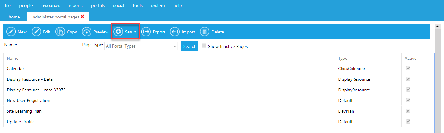
To add, edit, or delete widgets, go to Portals > Administer Portal Pages in the administrative menu.
On the Overview screen, highlight the name of the portal page that you want to edit widgets on and click Setup in the top toolbar.
If you are editing a brand new portal page, you will see a blank screen. If you are adding new widgets to an existing page, you will see the widgets determined in the initial page set up.
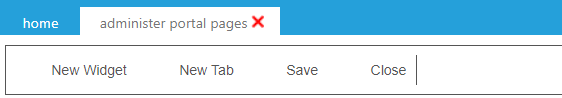
To begin adding new widgets to your page, click the New Widget button in the top toolbar.
The widget pop-up box will appear. This pop-up lists all of the types of widgets that are currently available. The various widgets have been categorized to assist in finding the correct widget.
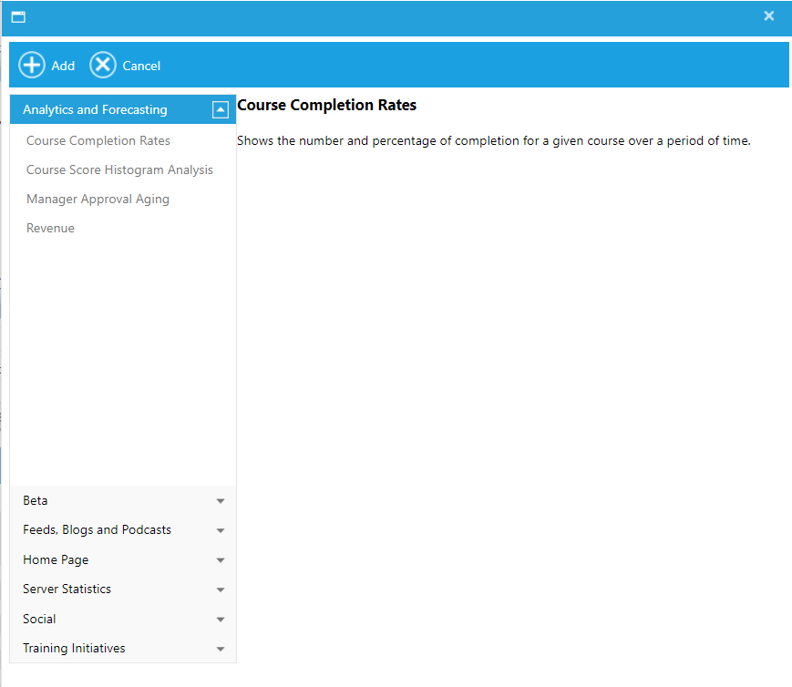
Highlight the title of any widget to see a description. Click the Add button to add the widget to your portal page.
Note: You can select any widget for any portal page. For example, the widgets listed under Home Page are widgets that are typically found on a Homepage, but they can be used on any page.
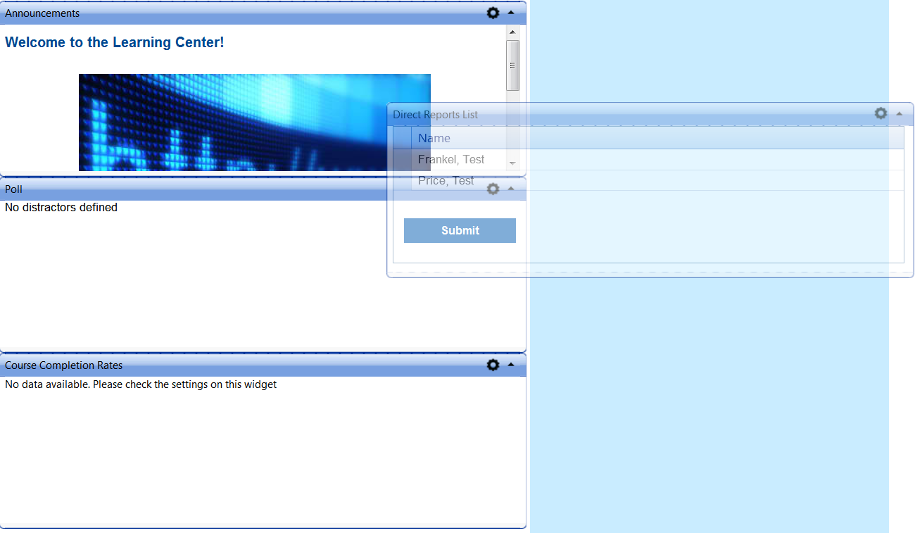
Once the widgets have been selected, you need to decide the layout of your page. The number of columns and the column width that were initially set up for the page will guide the layout.
As widgets are added, each one will be added to the first column. You can then drag and drop them to the desired location. If a set column width was selected in the initial set up, the width of the selected widget will automatically adjust as it is moved to different columns.
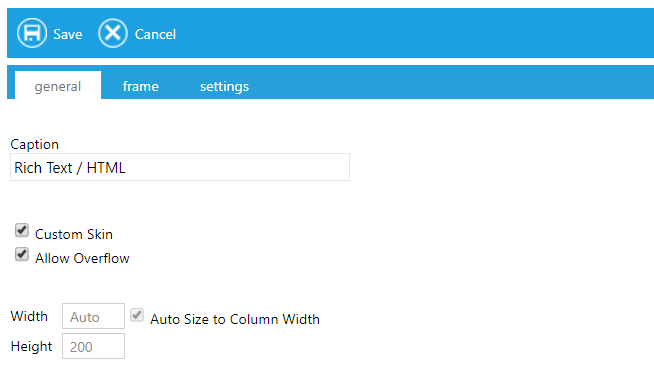
To edit a widget, click on the gear icon in the upper right-hand corner of the widget and select the Edit Widget option in the dropdown menu.
While some of the options will vary by widget, all widgets will have the same General options.
To delete a widget, click on the gear icon in the upper right-hand corner of the widget and select Remove Widget from the dropdown menu.