Rollout of Analytics has begun and will be introduced to your system starting Q2 of 2022.
Note
Security rights for Analytics are set up the same was as they are for Reporting. If you are a manager, you only see your own chain of command unless you have an additional security role that allows you to see other reports and report data.
Analytics can be useful in measuring and managing learner data such as training participation, required training compliance, and training effectiveness.
This information can provide insights to a business through data visualization, which can support decision making. In LearnShare, Visual Analytics data is organized into dashboards. Dashboards pull learner data and organize it into graphs and charts that simplify the information for the user to view.
There are currently two standard dashboards:
Completion Deadline Status - This dashboard shows the current status of all required training assignment deadlines.
On-Time vs. Late Completion % - This dashboard looks back and pulls information regarding required training deadlines and analyzes which have been completed on time versus those that were late.
Note
These dashboards show data up to the previous 24 hours. Typically, data refreshes nightly, depending on the configuration of your company. As a result, the data shown may not be current to the exact second, but it will be current within the last 24 hours.
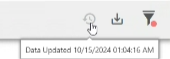
To verify the time of the last refresh, hover over the clock icon in the top right toolbar.
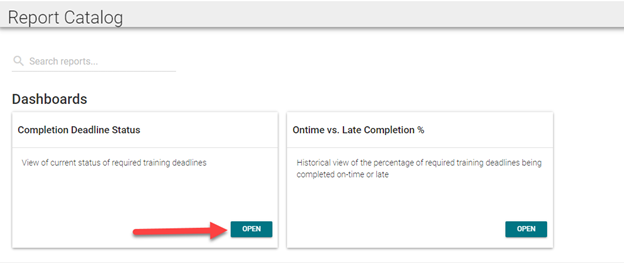
From the Report Catalog, select the dashboard you wish to view and click Open.
The next sections describe these dashboards in detail.
Completion Deadline Status Dashboard
From the Report Catalog, select the dashboard you wish to view and click the Open button.
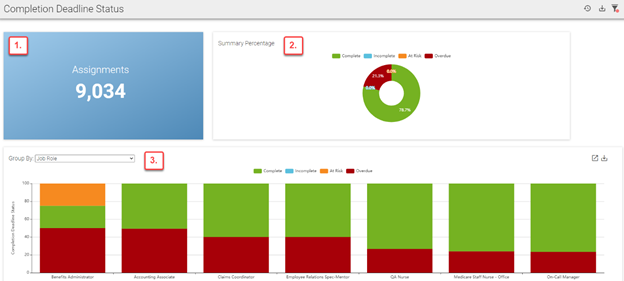
The dashboard will open to display widgets that contain information based on learner data. The Completion Deadline Status dashboard displays:
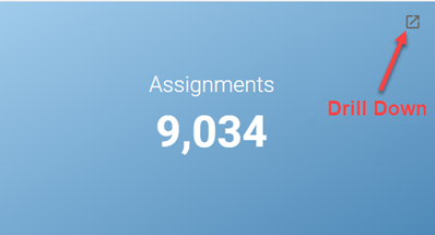
Total number of assignments for all learners
Total percentage of complete, incomplete, at risk*, and overdue assignments
Percentage of complete, incomplete, at risk*, and overdue assignments by group
*At risk assignments are determined based on assignment due dates and are client-specific. Users can define which assignments are at risk by specifying a certain number of days before the due date. For example, a company may consider an assignment to be at risk if it is not completed two days before the due date.
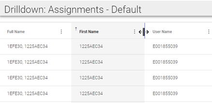
Each widget on the dashboard has the ability to "drill down" data to show more detail. Click the Drill Down icon in the corner of the widget to open a new tab that will display additional learner data in the form of a chart.
Data fields in the chart will vary based on client preference. Each field can be used to sort the data. Click the three vertical dots (ellipsis) next to any field you wish to sort the data by. Each column can be sorted in ascending or descending order.
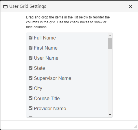
To add or remove fields from the chart, click User Settings. Check all boxes from the list that you wish to include in the chart. To remove a field from the chart, uncheck the box. Click and drag a field to move its location in the chart. Drill Down preferences, such as hidden and visible columns, will be saved per user/dashboard.
To resize columns, place your cursor over the space between two columns until the cursor icon changes to a vertical line with an arrow on either side. Click and drag the cursor to adjust the column size.
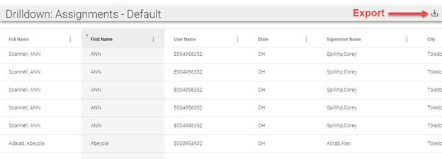
You can also click the Export icon at the top right corner of the Drill Down screen to export the data to Excel.
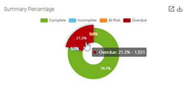
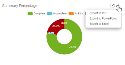
The Summary Percentage widget displays the percentage of all required training assignments by status (complete, incomplete, at risk, or overdue). Place your cursor over a section of the graph to reveal the numerical value of the percentage shown. Click a section of the graph to open a new tab that displays data for each assignment that falls under the selected category.
You can click the Export icon to export the data from this graph into a PowerPoint, Excel, or PDF file. The Export icon is available for most dashboard widgets as well as the dashboard itself. See Dashboard Toolbar for more information on exporting dashboards.
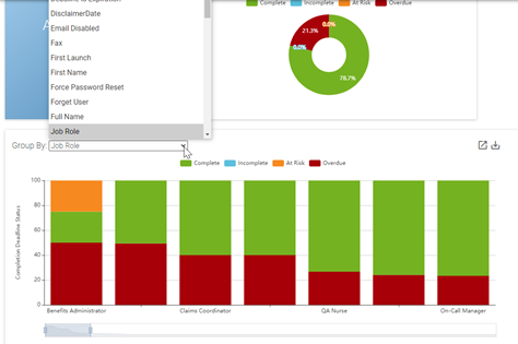
To view complete, incomplete, at risk, and overdue assignments by group, click on the drop-down box in the Group By widget and make a group selection. The bars in the graph are sequenced from greatest to least according to potential areas of concern (incomplete, at risk, and overdue).
Like the Summary Percentage widget, you can place your cursor over a portion of the graph to see the numerical value of the percentage shown. You can also drill down and export this information.
Note
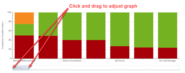
If you have more data fields than will fit on your screen, an adjustment bar will appear below the bar graph. You can click and drag the handles on the adjustment bar to change the width of each bar within the graph. This will allow more or fewer bars to fit on the screen. You can click and drag anywhere inside the adjustment bar to manipulate which areas of the graph are visible on the screen.
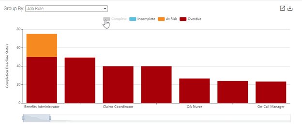
If a graph has a legend, you can click any of the categories to turn them off. This removes the data related to that category from the graph and draws attention to areas of potential concern. Click the category in the legend again to add the removed data back to the graph.
On-Time vs. Late Completion % Dashboard
From the Report Catalog, select the dashboard you wish to view and click the Open button.
The dashboard will open to display widgets that contain information based on current and historical learner data. The On-Time vs. Late Completion % dashboard displays:
Total number of assignments for all learners
Total percentage of on-time, late, and to be determined assignments
Percentage of on-time, late, and to be determined assignments by time of deadline
Percentage of on-time, late, and to be determined assignments by group
Each widget on the dashboard has the ability to "drill down" data to show more detail. Click the Drill Down icon in the corner of the widget to open a new tab that will display additional learner data in the form of a chart.
Data fields in the chart will vary based on client preference. Each field can be used to sort the data. Click the three vertical dots (ellipsis) next to any field you wish to sort the data by. Each column can be sorted in ascending or descending order.
To add or remove fields from the chart, click User Settings. Check all boxes from the list that you wish to include in the chart. To remove a field from the chart, uncheck the box. Click and drag a field to move its location in the chart. Drill Down preferences, such as hidden and visible columns, will be saved per user/dashboard.
To resize columns, place your cursor over the space between two columns until the cursor icon changes to a vertical line with an arrow on either side. click and drag the cursor to adjust the column size.
You can also click the Export icon at the top right corner of the Drill Down screen to export the data to Excel.
The Summary Percentage widget displays the percentage of assignments that are on-time, late, and to be determined (not started, but not past deadline). Place your cursor over a section of the graph to reveal the numerical value of the percentage shown. Click a section of the graph to open a new tab that displays data for each assignment that falls under the selected category.
You can click the Export icon to export the data from this graph into a PowerPoint, Excel, or PDF file. The Export icon is available for most dashboard widgets as well as the dashboard itself. See Dashboard Toolbar for more information on exporting dashboards.
The Summary Trend widget displays assignments that are on-time, late, and to be determined based on the time of deadline. You can click the drop-down box to select a deadline time frame.
To view on-time, late, and to be determined assignments by group, click on the drop-down box in the Group By widget and make a group selection. The bars in the graph are sequenced from greatest to least according to potential areas of concern (late and to be determined).
Like the other widgets, you can place your cursor over a portion of the graph to see the numerical value of the percentage shown. You can also drill down and export this information.
Note
If you have more data fields than will fit on your screen, an adjustment bar will appear below the bar graph. You can click and drag the handles on the adjustment bar to change the width of each bar within the graph. This will allow more or fewer bars to fit on your screen. You can click and drag anywhere inside the adjustment bar to manipulate which areas of the graph are visible on the screen.
If a graph has a legend, you can click any of the categories to turn them off. This removes the data related to that category from the graph and draws attention to areas of potential concern. Click the category in the legend again to add the removed data back to the graph.
The Dashboard Toolbar
The dashboard toolbar can be found at the top right corner of the dashboard. You can use these tools to manage data within the dashboard.
Click the Clock icon to view the last time the dashboard was updated.
Click the Filter icon to narrow down information shown on the dashboard. See Using Filters belowfor more information.
Click the Export icon to send that data from the dashboard to a PowerPoint or PDF file.
The first page of the exported file will contain the dashboard name, the user's name who initiated the export, the time of the last data update, and any filters that are in use. Each graph displayed in the widgets on the dashboard will follow this page.
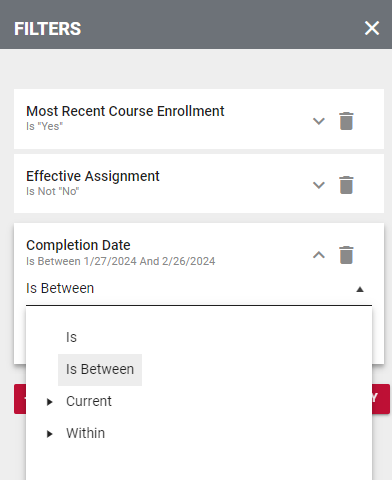
Using Filters
Filters allow the user to generate analytics based on specific criteria. For example, a user may want to look at data based on a certain geographical location or they may want to check the status of a particular course title.
To manage filters, locate the Filter icon (funnel) in the dashboard toolbar.
Each dashboard has its own set of default filters. The example below shows the default filters for the Completion Deadline Status dashboard.
To add a new filter, click the Add Filter button and select a filter from the drop-down menu. Fill in the needed criteria for the filter and click the Apply button.
To remove a filter, click the Remove icon (trash can), then click the Apply button.
To remove a selection from the pick list, click the X icon next to the selection.
Filter pick lists can vary. Some pick lists, such as the completion Date filter pick list, require dates or date ranges. Click the drop-down box to view the different date range options.
Choose an option under the Current category to select the current day, week, month, quarter, etc.
Choose an option under the Within category to filter the data by a user-specified number of time increments (days, weeks, months, etc.). In the example below, the user chose to filter Complete Date data that occurred within the last 21 calendar days.
It can also be useful to filter by supervisor name. After selecting the Supervisor Name filter, click the drop-down area or begin typing a supervisor's name to make a selection. Click the Full Hierarchy checkbox to include data for every learner within the selected supervisor's hierarchy. If the Full Hierarchy box remains unchecked, data will only be provided for the supervisor's direct reports.
For a brief instructional video on Analytics, please see below.